based on Lars Palmqvists Map Archive
The area I am working today was first mapped before 1971 in a scale of 1:20'000 and 2.5m intervall by SoIK Hellas (no single authors mentioned).
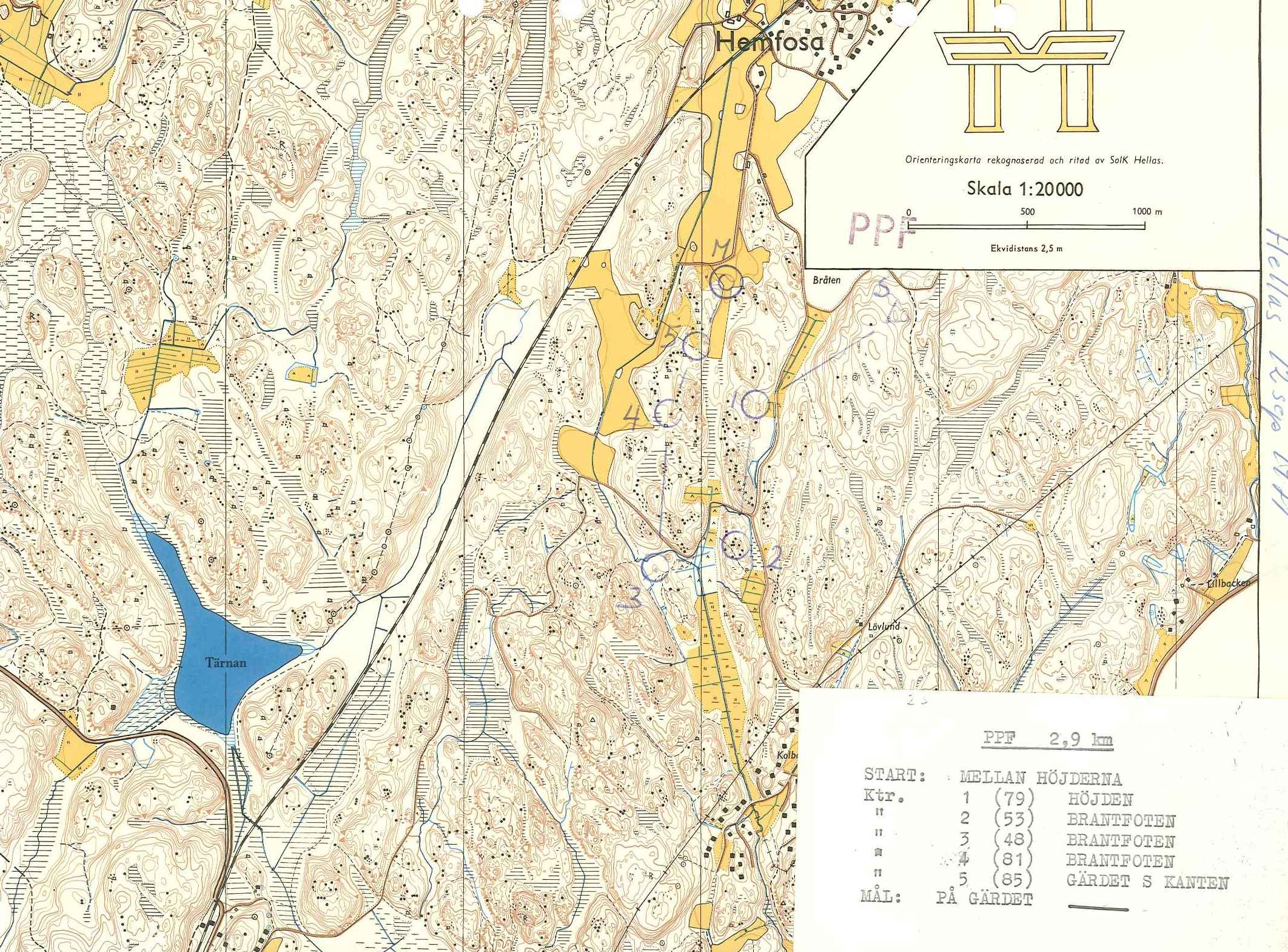
fig.1. 1971
The map itself did not follow any international standard.
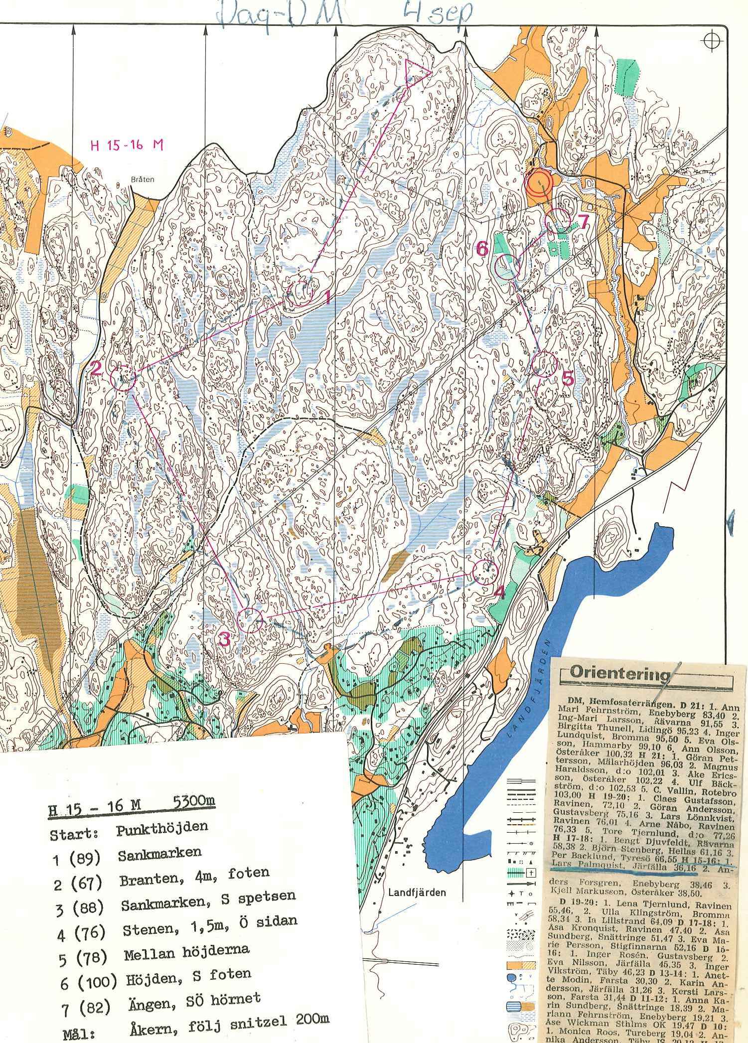
In 1977 a new map according to ISOM1975 with its new palette of runnability signatures (yellow and green) appeared.
fig.2. 1977 (southern part)
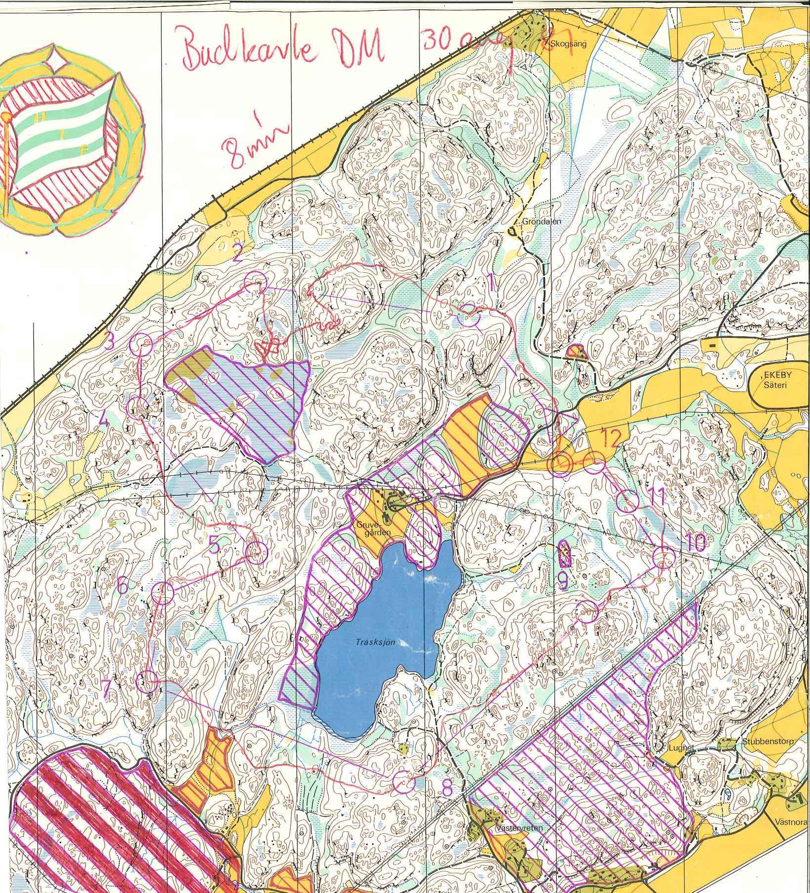
1981 a new map again. It seems the 1977 was revised and more standardized signatures (f.ex. rock faces) where applied.
fig.3.1981 (northern part)
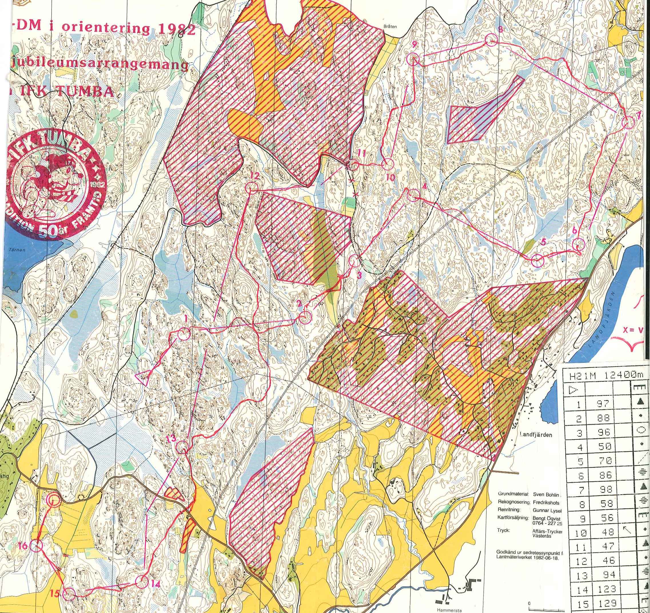
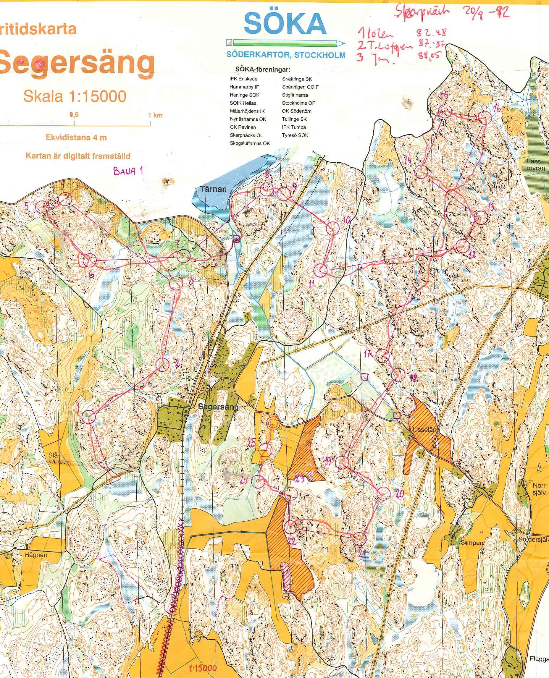
And already in 1982 the next revision with once more standardized signatures (f.ex. single tracks; ISOM 1982?). Here we get for the first time a glimpse on the authors: Basematerial: Sven Bohlin, Fieldwork: Fredrikshofs [IF, Tyresö], Drawing: Gunnar Lysel[l]
fig.4. 1982 (southern part).
Then in 1992 a new map, according to ISOM 1990 (the green stripes ISOM) and "digitally produced". This map was sort of a pre-map to the later SM-map. Parts of this map also appear in the latter being produced 1993-1994.
fig.5. 1992 (southern part)
History of the current map
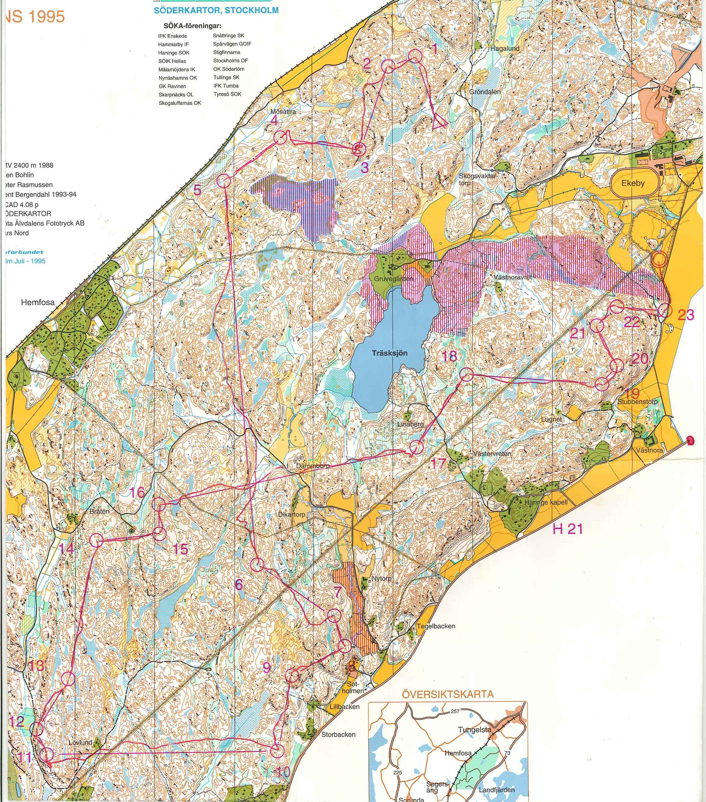
In 1993-1994 the map I am revising was produced for the Swedish Long Distance Championships. The map was based on Sven Bohlins Base-Material he extracted from airborne images (2400m) from 1988. Peter Rasmussen did the fieldwork. Kent Bergendahl the digitization with OCAD 4.0p (on later excerpts of the map Bergendahl was also credited for fieldwork as Rasmussen for digitization and finally only Bergendahl was mentioned).
fig.7. 1995 (center part)
- The map was according to the ISOM 1990 and of outstanding quality mostly in regard of the relief interpretation (based on airborne image combined with a very experienced interpreter, Sven Bohlin). This is probably a quality we have a hard time to reach due the luxury of the airborne laser data.
- The drawing instead has from the todays point of view some weak points.
- OCAD 4.0p did probably not support bezier-curves, so everthing had to be drawn "dotted". This makes the file very unhandy for revisions.
- The whole map seems to be "thought from the airborne image". Everything was more or less placed disregarding symbol sizes as, minimal distances between objects. This has negative impacts on the maps readability.
- Due to the primacy of the base-material and probably some limitations of OCAD 4 objects like 103 form line where not drawn with their according symbol but every single dash with 101 contour. Similar for 307 minor water channel. Also other object like 104 slope line, 515 railway, 516 powerline, 512 footbridge, 312 well where drawn with non-according symbols. This makes the file unhandy for revisions of map specifications.
This map was revised by Bertil Lundkvist in 2006 and thereby adapted the ISOM 2000 (the elongated knoll revision).
fig.9. 2006 (northern part)
In regard of the map broadly merited Lundkvist did a good job. In regard of the drawing he
- continued "dotting"
- added new missymbolisations like filling small hills drawn with 101 contour which should according to ISOM2000 be converted to 113 elongated knoll with dots of 117 broken ground or 112 small knoll instead. Therby he avoided to introduce the minimal measures for small knolls.
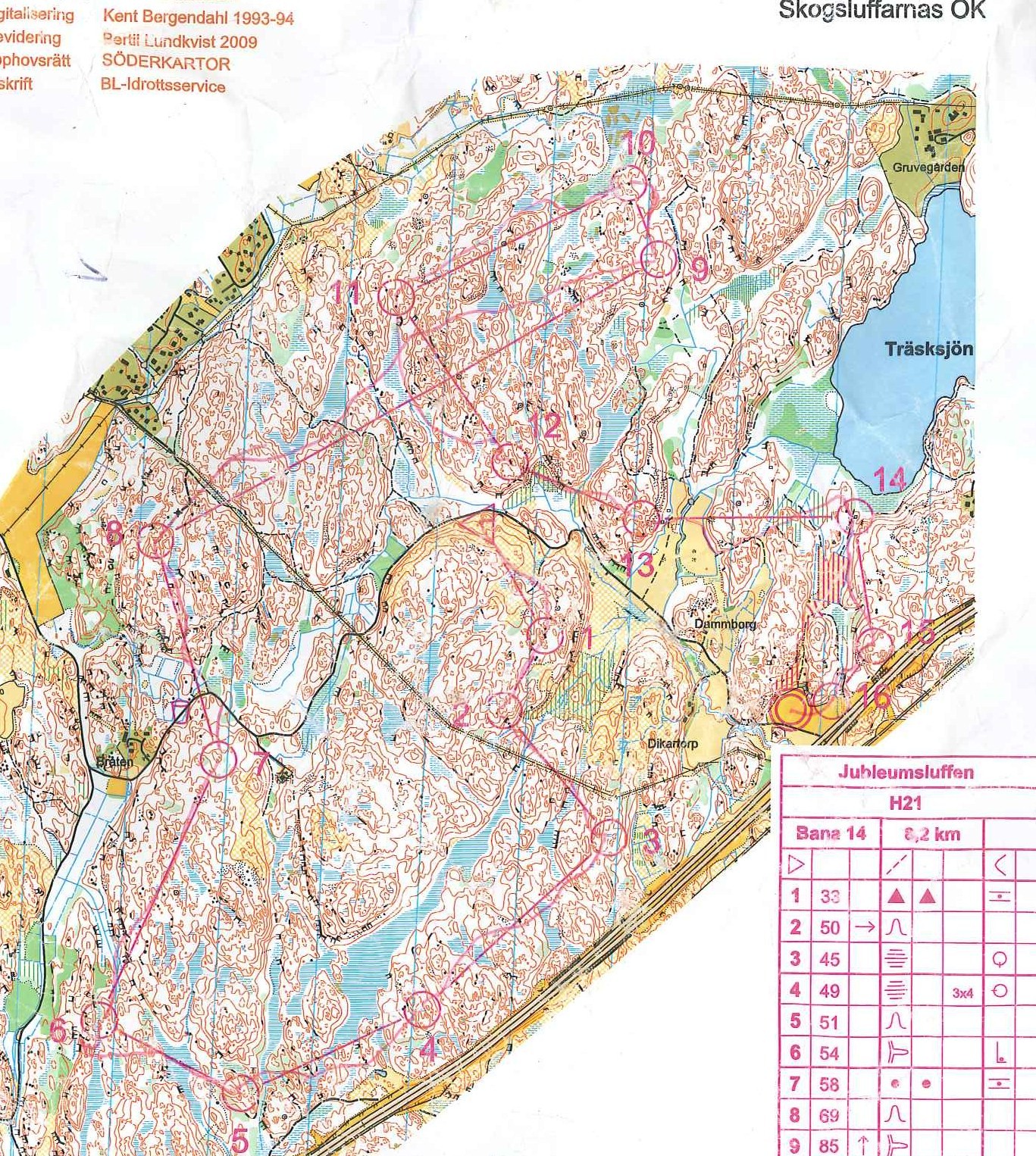
Lundkvist revised the map once again in 2009 as a new motorway crossing the forest was build. This revision seems to have been strictly limited to the necessary, leaving obvious lacks outside these limits.
fig.11. 2009
Summary
The map has a long history and the maps basic quality is very high.
The maintenance of the drawing is nowadays a crucial task to a mapper, and a clients investment into the maps future. Therefore the drawing should be enhanced.
Then, the readability should be enhanced by pushing through the existing minimal measures and minimal gaps.
And of course, it is time for a smooth revision...




Keine Kommentare:
Kommentar veröffentlichen